Hello!
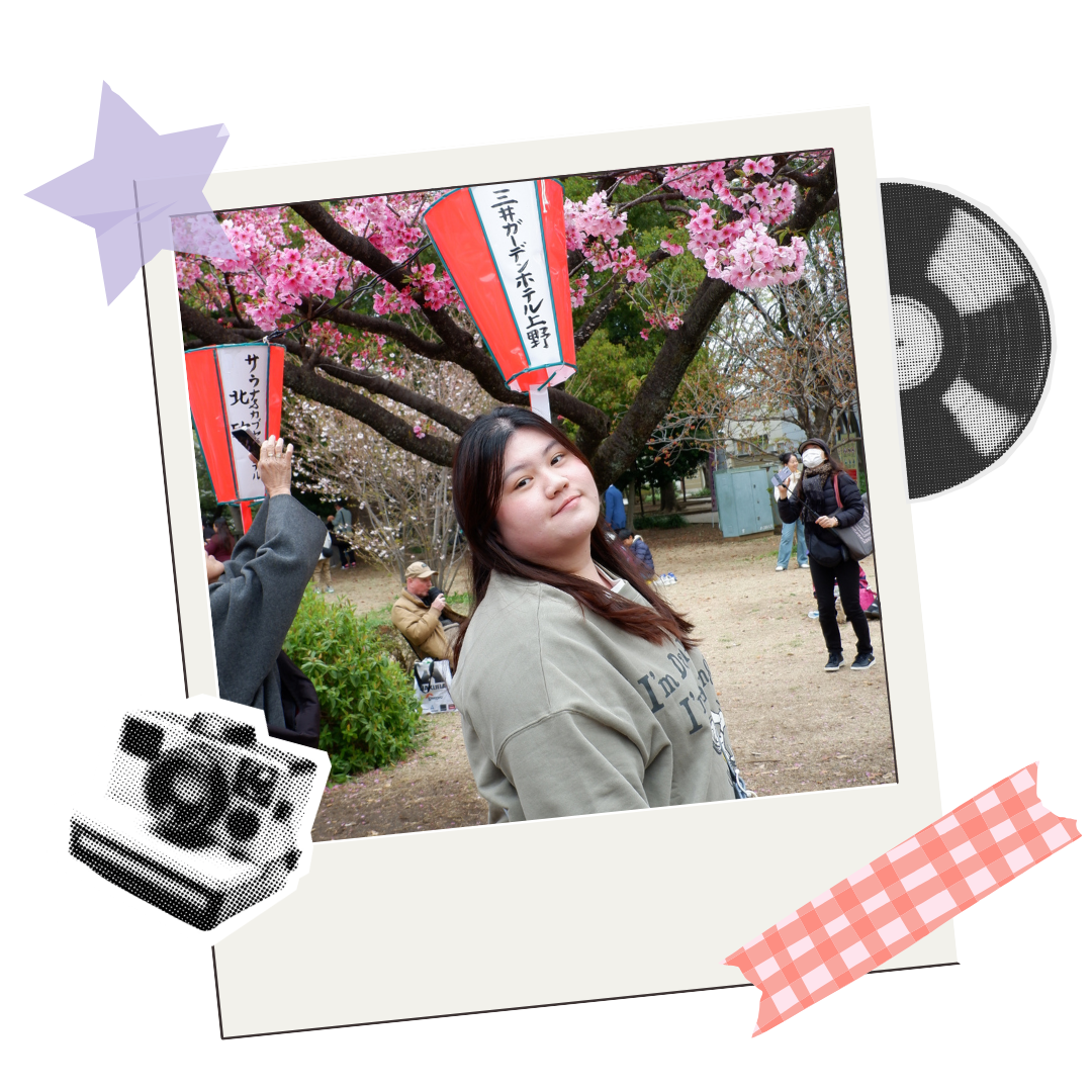
I'm Luisa Tiovany, also known as "Lui" or "Luisa" . I was born on March 3rd 2005 and based in South Tangerang, Banten. I Am not just a student, but also a K-Pop fan and traveler deep in my heart. I'm a graphic designer that love to explore different art styles and follow the trends, just like my cheerful and adaptable personality. I still have a lot to learn, but I'm eager to keep learning and exploring through design projects.
2023 - present
Visual Communication Design - New Media
BINUS SCHOOL Serpong2020-2023
General Streaming (2020-2021)
IT with Art & Design (2021-2023)
Photoshop, Illustrator, Indesign, After Effects
IllustrationProcreate
3D MakingBlender
Video EditingCapcut
Poster, Presentation, InfographicsCanva
Bahasa Indonesia Native Speaker
English Upper Intermediate
Korean Beginner
Chinese Beginner
Experiences
Member of Publication / Social Media (2020-2021)
Head of Welfare / Finance (2021-2022)
BINUS SCHOOL Serpong 'Culture Club'Member of Publication / Social Media (2021-2022)
BINUS SCHOOL Serpong 'First Year Program (FYP) B2028'Freshmen Partner for Fashion B2028 BINUS Alam Sutera (2024-2025)
Digital Marketing Intern (2023)
Master of Ceremonies (2022)
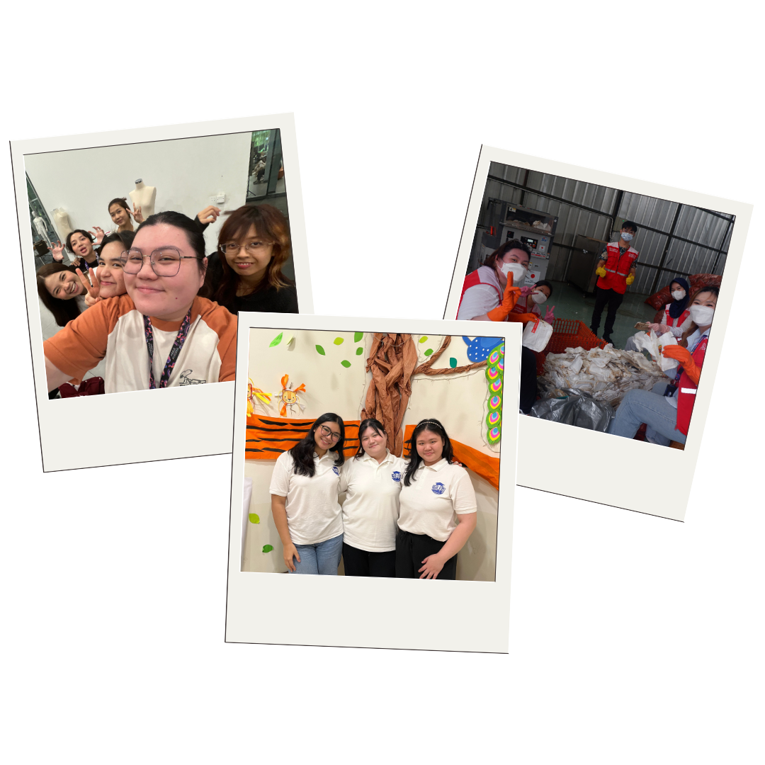
Jakarta Recycle Center Volunteer (2024)
FamFest by Ibu2Canggih x Lightbeam EducationMandarin Teacher with Liu Li Mandarin
Portfolio
Branding
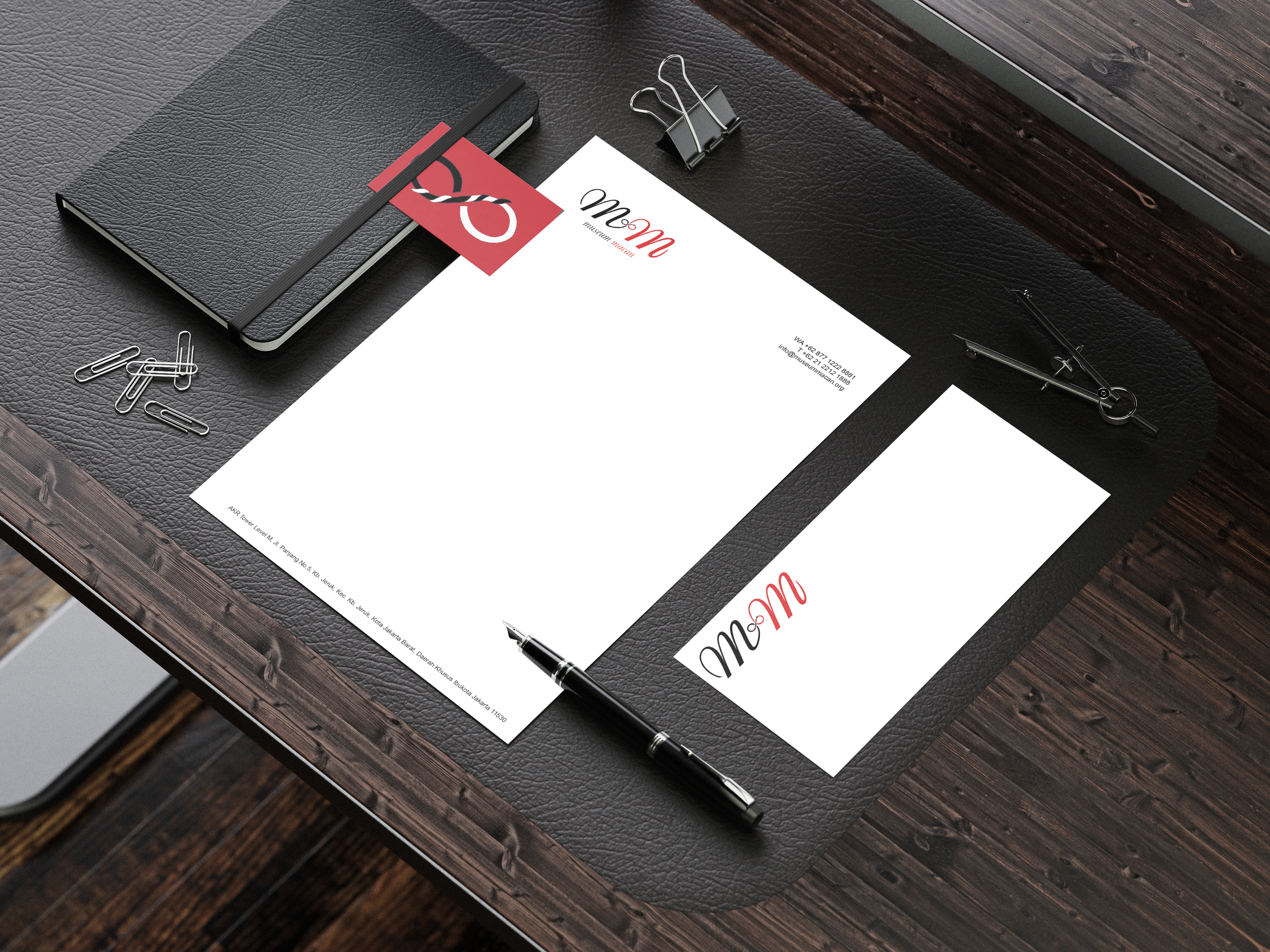
Museum MACAN Rebranding
Why I chose red, black, and white as the color palette is because it is the color palette of the museum itself (before it changes). The infinity sign on the logo symbolizes the infinity connection of people has. While the ties in the infinity symbolizes connections.
In this portfolio, I'm showing my flyer, business card, and letterhead design. In order to match the museum's vibes based on interior, original logo, website, I made the designs are simple to show the simplicity and elegance.
Branding
Oflan Indonesia Logo Rebranding
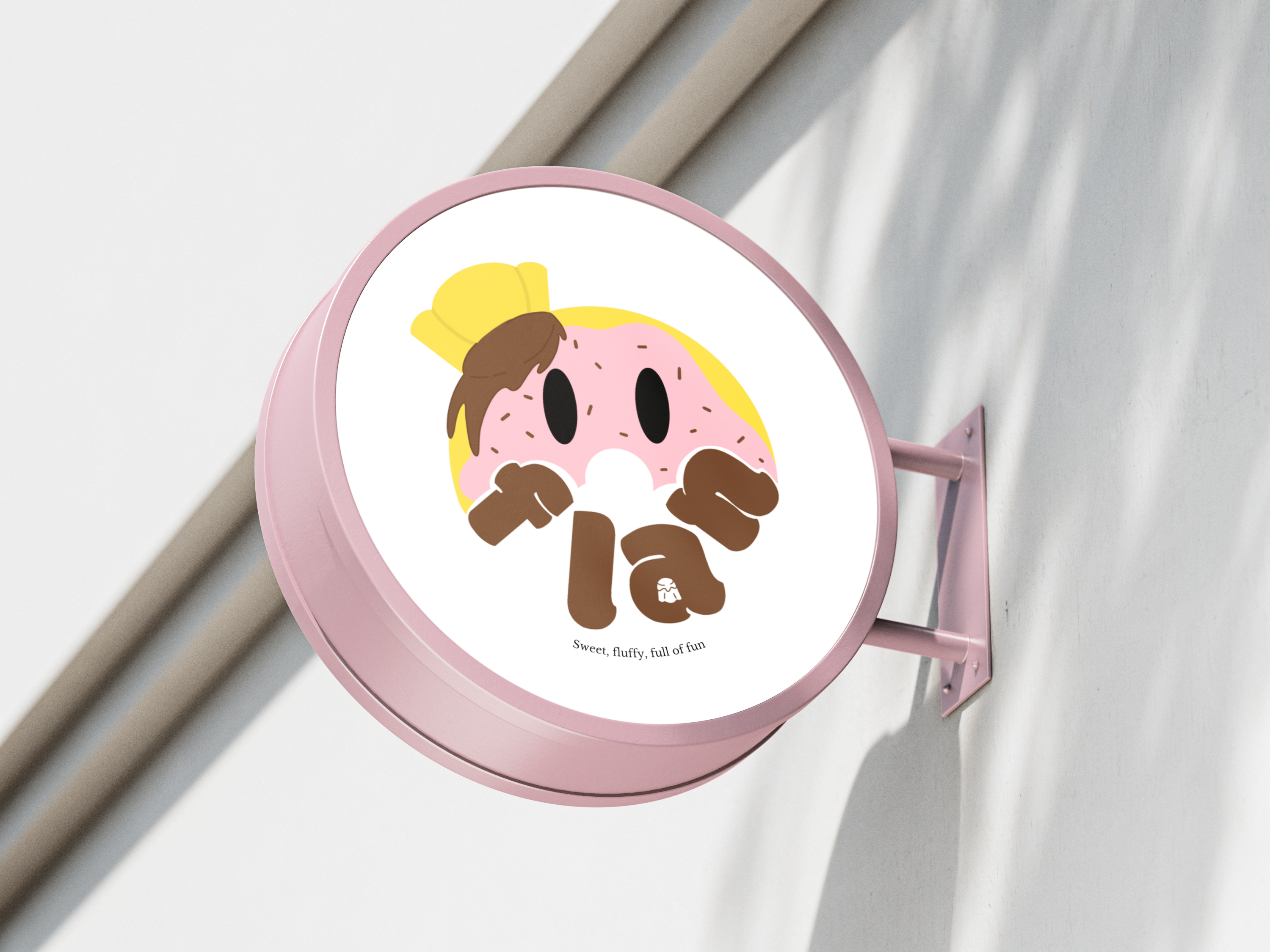
So, what is Oflan Indonesia?
Oflan was emerged after the pandemic, originally selling simple topping donuts (3 for Rp 10,000), aimed to create something more distinctive. So, they invented a new, hybrid, "donut-flan": a soft, creamy-filled donut made using pure cream milk instead of condensed milk. resulting in a richer yet balanced sweetness. Oflan is owned by Jevin Suryadi, who was inspired by finding a unique pairing for coffee. Imas Nurmalasari as the head of production, and Yunita as customer service.
Their unique creation went viral one month after launching online, and they sold over 36,689 donuts in just five months, even being featured organically on DetikFood.
Their target market are young adults (20-30) that are active in social media and trend-aware, so I decided to make a mascot logo with bright colors. The idea is to replace the O with donut, so It's read as Oflan. And made the flan as the chef's hat. At the end, I added a tagline "Sweet, Fluffy, Full of Fun" to describe the taste and look of Oflan Indonesia. I also added some mockups to see how can the logo be implemented from boxes, to store signs. I feel a lot fun in the making of logo with the touch of my style, and I learn more on logo branding.
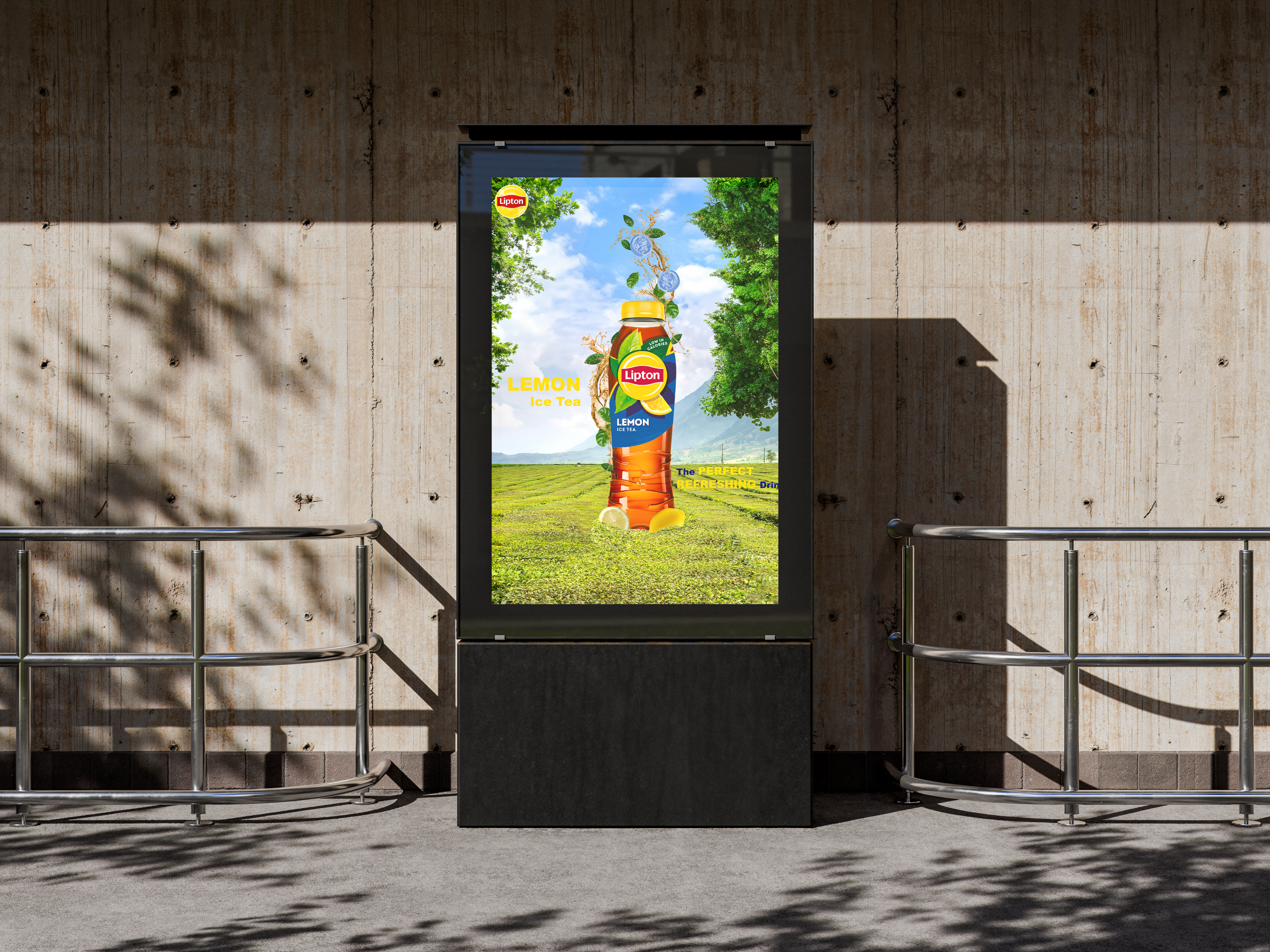
Advertisement
Lipton Lemon Tea Advertisement
Photography
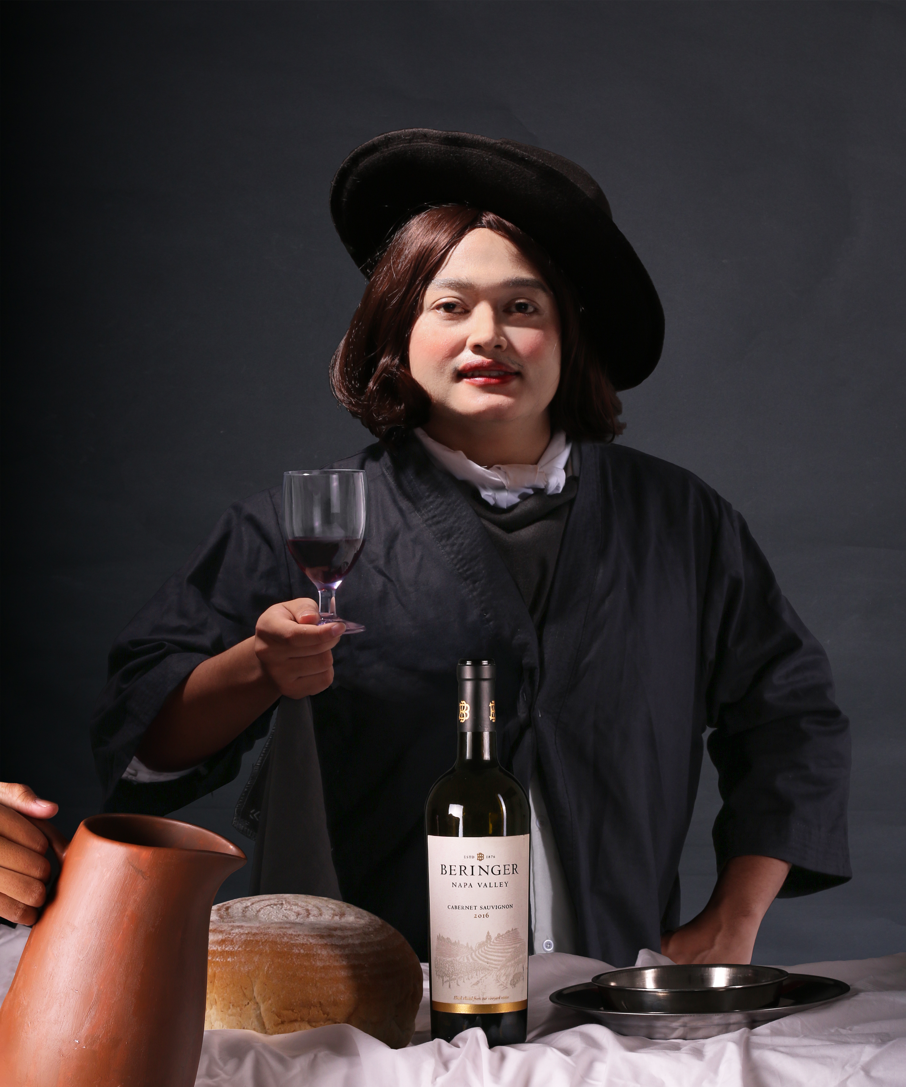
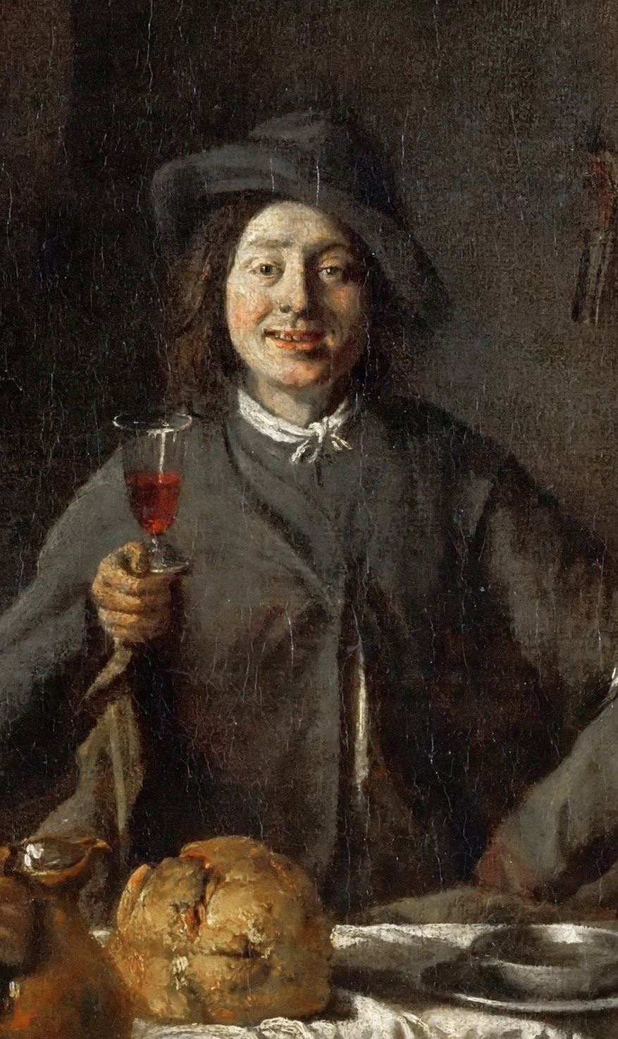
'The Return of Bapteme' Recreate
As a part of the team, I handle costume and property, also helped with lighting on set. Since the exam is about Advertisement, we use Beringer Wine as our advertisement, and wine matches the vibe of the painting itself. We tried to find models that are quite similar but it was quite a challenge. We did 2 test shots before the final shot. For lighting itself, we use 3 source of lighting to create rembrandt lighting technique.
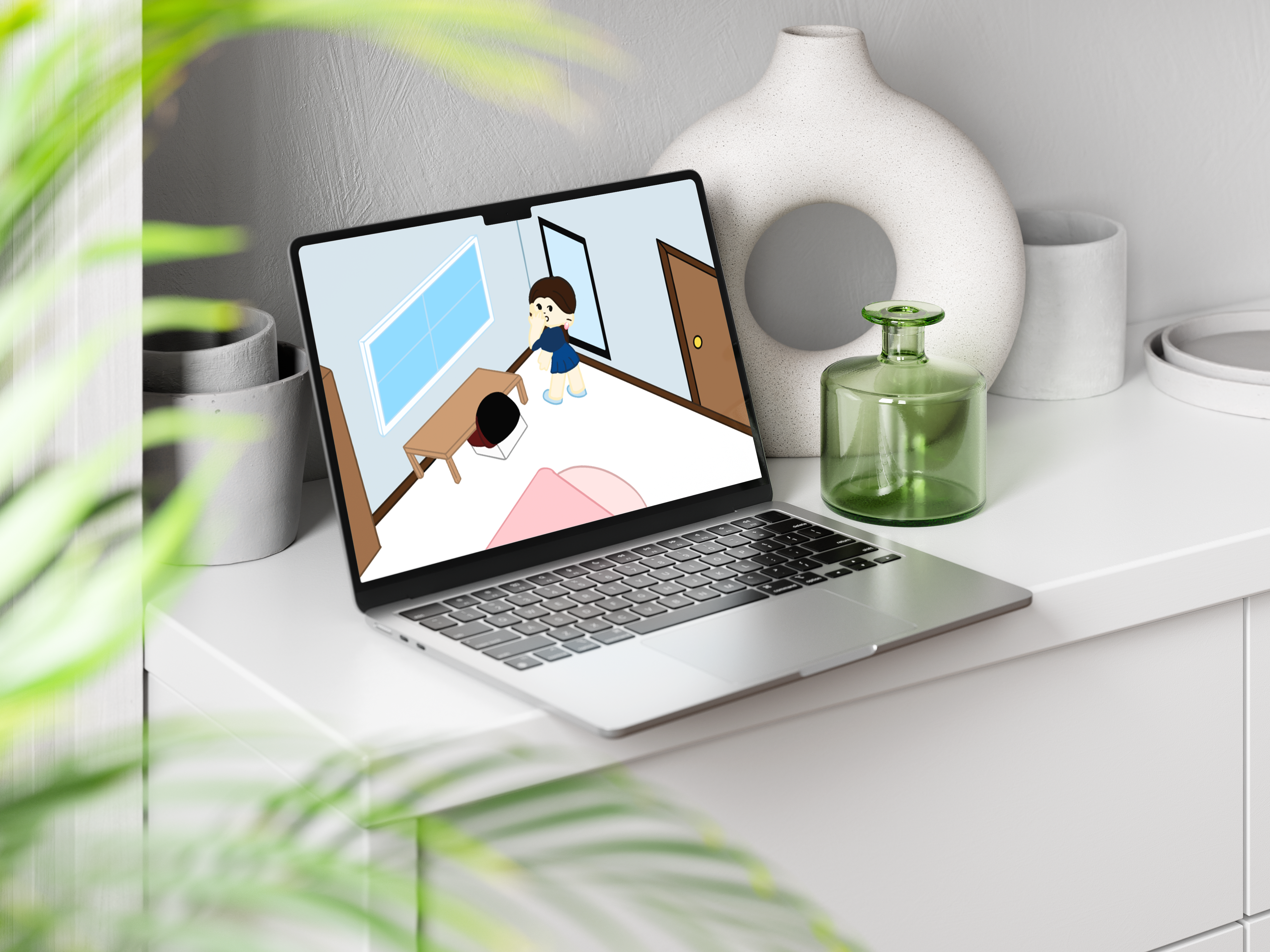
Motion Video
Recycled Plastic Earrings
Illustration & Printing
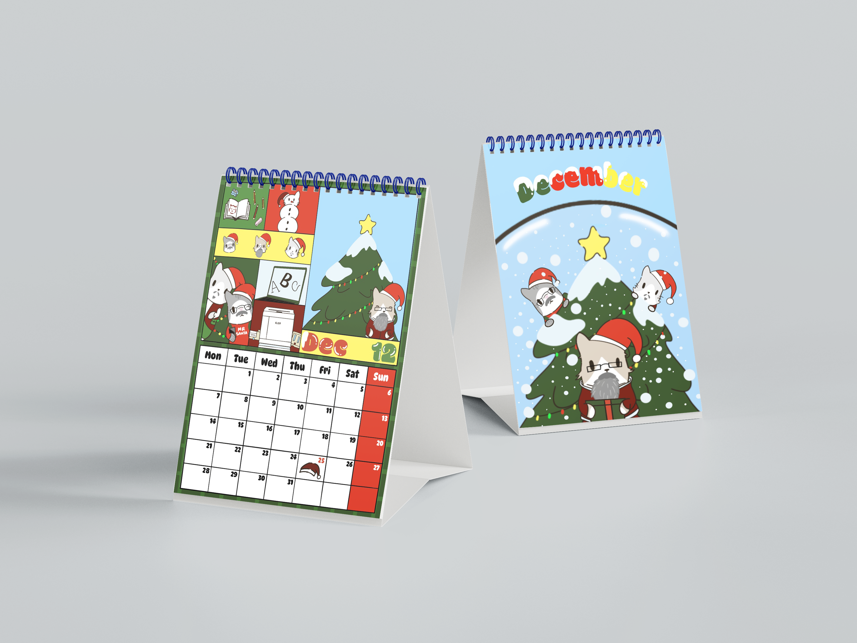
Calendar 2026
The 2026 Calendar was a project done on 2025 during my 4th semester as a part of the 'Digital Graphic Reproduction' Class. In this class, we learn about printings and productions. The theme of the calendar is Visual Communication Design. So we discussed and observed our campus surroundings. Then it came up with the idea of cats and lecturers. In our BINUS Alam Sutera campus, we see different kinds of cats and most students love them with care. Then, we combined our idea of 'Cats & Soup' cats style, with the faces of lecturers in BINUS Alam Sutera. We also discuss about which lecturers fits which months or which subjects fits the month.We divided the workload based on the 4 seasons, winter, spring, summer, autumn. In this project, I was in charged of winter (December, January, February) For December, we have Mr Ruji (Digital Graphic Reproduction lecturer), Mr Husnawi (Drawing for Design lecturer), and Mr Pray (Typography lecturer). Even though the three of them are from different class subjects, the reason why we chose them is because of their beard and we can make them into santa claus, which is a big celebration in December. Then we have Ms Ira and Ms Vera. We chose them in January as a start of calmness and happiness. Then my workload ended in February. The three of them is Mr Felix, Mr Hady, and Ms Earlene. The reason we chose them is because they're in the same team as the Photography lecturer, where we as Indonesian said "fotografi". The F in Fotografi represents February. The theme is pink and hearts since it is valentines day on the 14th.
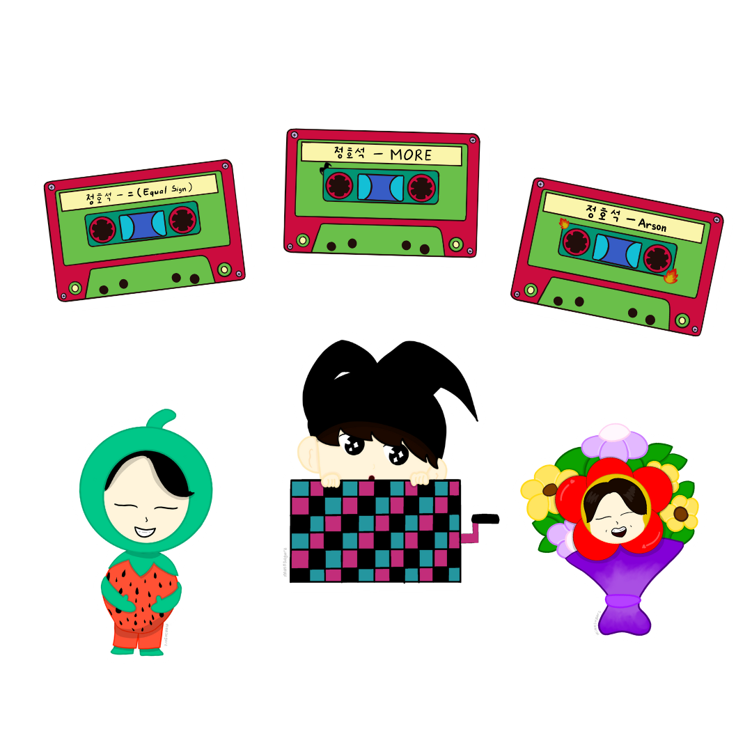
Merchandise
'Hope On The Stage" in Jakarta